VIWELL Visual Brand Guideline
Objective
At VIWELL, the goal was simple but bold: to make a platform for holistic wellbeing that people could use at any point in their health path. The project needed a good balance between how it looks, how good the information is, and how it works for the user.
Logo Design
When thinking about VIWELL's character, the first thing I did was make a logo that shows what we stand for. The VI stands for the number 6 in the roman clock; the number 6 represents VIWELL's six wellbeing bills. I wanted it to be simple but still stand out.
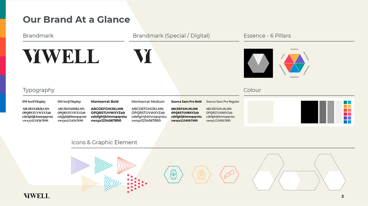
Visual Guidelines
Creating a visual language for VIWELL wasn't just about making it look good; it was also about making people feel confident, calm, and upbeat. From choosing color palettes that make people feel calm to deciding on easy-on-the-eye fonts, the visual rules were carefully thought out to give users an immersive experience.
VIWELL Visual Guideline


I was heading the content team at VIWELL where Wellbeing Library was produced , A wide variety of video, audio and textual content covering each of the six pillars of wellbeing by leading global health and wellness experts in both Arabic and English.


